.png)
There are several reasons to like the Notion app. It's feature-rich, has an organized interface for all your documents and notes, it can be used to build databases and landing pages, and is available on multiple platforms. It also works well with sister apps like Notion Mail and Notion Calendar, so you're getting a complete ecosystem that can give Google's services a run for their money. Despite these features, I haven't been able to stick to Notion for too long, as I feel the UI is quite cluttered. That said, I recently discovered Notion's Calendar View approach, and it convinced me to give the app another shot—this time, to track my work progress.
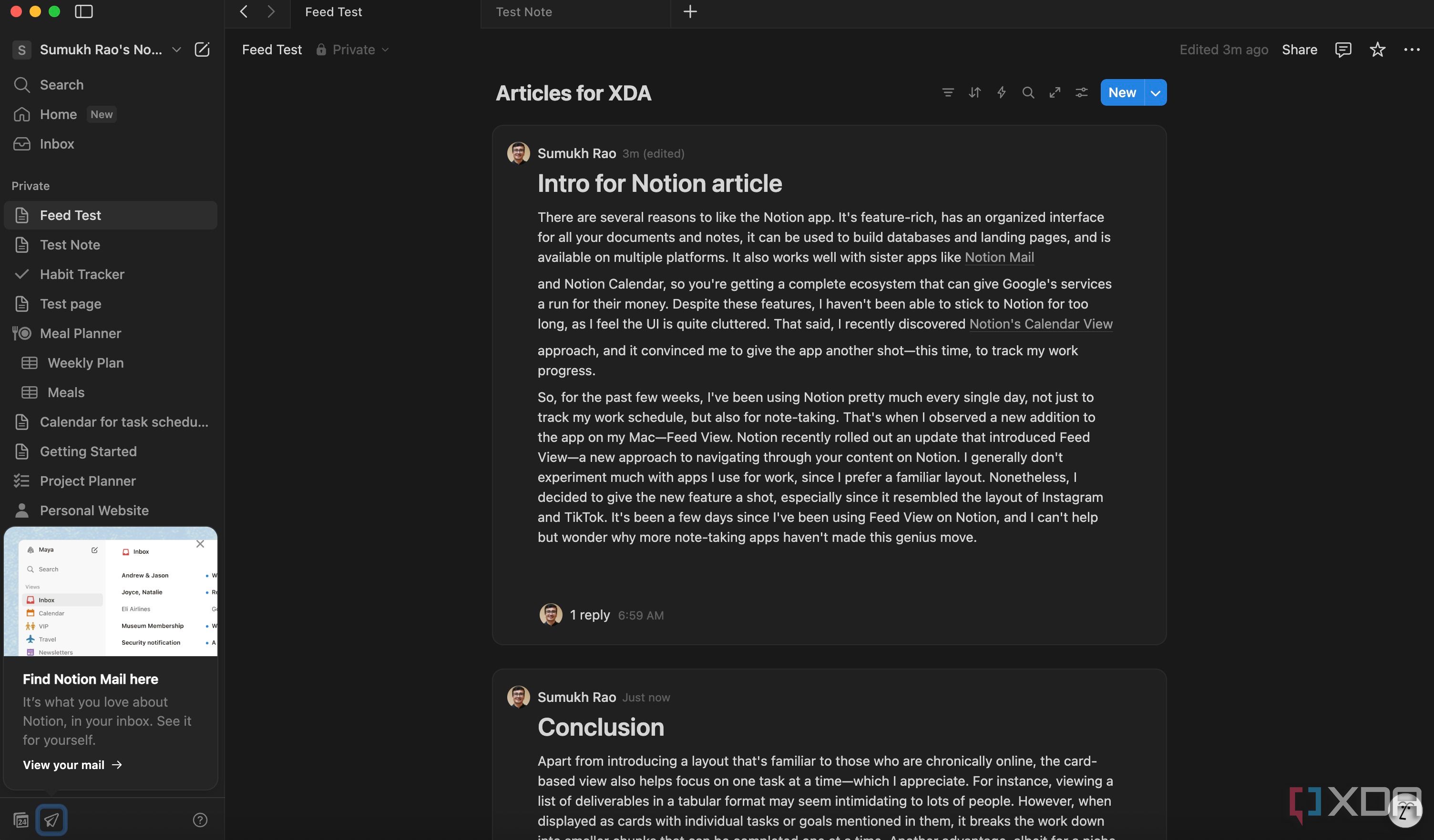
So, for the past few weeks, I've been using Notion pretty much every single day, not just to track my work schedule, but also for note-taking. That's when I observed a new addition to the app on my Mac—Feed View. Notion recently rolled out an update that introduced Feed View—a new approach to navigating through your content on Notion. I generally don't experiment much with apps I use for work, since I prefer a familiar layout. Nonetheless, I decided to give the new feature a shot, especially since it resembled the layout of Instagram and TikTok. It's been a few days since I've been using Feed View on Notion, and I can't help but wonder why more note-taking apps haven't made this genius move.
Related
What's so special about it?
Scrolling is addictive
If you observe most new social media and content platforms, they're all capitalizing on the vertical video format. This is mainly because millions of people across the world enjoy watching content in this format for multiple reasons. It doesn't require a long attention span, you can watch it wherever you are, without tilting your phone, and you get a wide variety of content in less time. Most blogs and websites also follow a vertical scrolling format. Owing to this, people on the internet are used to scrolling vertically on their screens. Notion's Feed View takes advantage of this user behavior.
There are two ways to trigger the new Feed View on Notion. When you create a new document, all you have to do is enter /feed and select the Feed View option. This will create a new layout with a card view. You can then click on each card and add information inside it. There are different metadata that you can add to the card, like due date, links, tags, etc. There's also a comments section, which is useful when you're collaborating with several users. Once you've finished populating a card, you can move on to the next one. You can add as many cards as you want, one below the other, and they will all show up vertically. You can scroll indefinitely till you have found the last card. This is similar to how a webpage, social media feed, or TikTok would operate.
My brain is wired to vertical content
Individual cards are good for focus
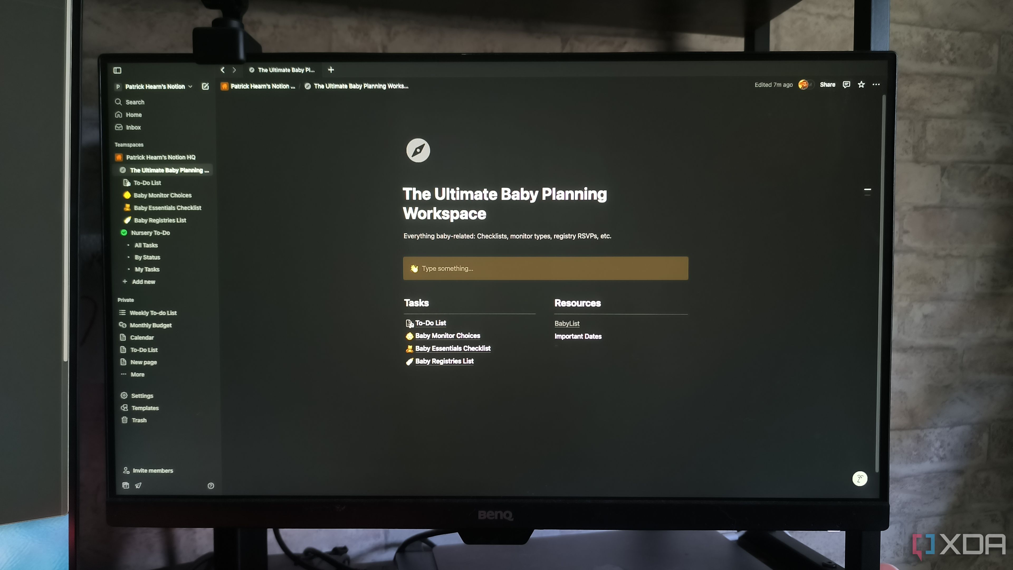
The best part about the feature's rollout is that Notion hasn't restricted it to just new documents or data. If you have an existing database in the form of a table, calendar, or any other format supported by Notion, you can convert it into Feed View. I personally found this to be helpful for daily schedules, trip itineraries, meal plans, workout guides, etc., where you want to focus on one task at a time. As opposed to traditional vertical content that's designed for those who have short attention spans, Feed View actually helps with focusing on a particular task or process by keeping everything else in the background.
Once you have completed the task at hand, scroll down and move to the subsequent one. I have recently started making my work timetables in this manner, allotting several articles as individual tasks, one below the other. Once I publish an article, I move to the next card. I tried doing this with a generic table inside Notion, but I found the Feed View approach to be better. I can focus on the contents of a single article without getting distracted. In fact, the text box allows me to type my article right inside each card, if I wish to maintain a local repository of my work. You can try converting an existing table into a Feed View by hovering your mouse over it and clicking on the Settings icon > Layout > Feed.
Apart from introducing a layout that's familiar to those who are chronically online, the card-based view also helps focus on one task at a time—which I appreciate. For instance, viewing a list of deliverables in a tabular format may seem intimidating to lots of people. However, when displayed as cards with individual tasks or goals mentioned in them, it breaks the work down into smaller chunks that can be completed one at a time. Another advantage, albeit for a niche set of individuals, is that the Feed View looks and works much better than other database layouts on vertical monitors.
Related


 English (US) ·