.png)
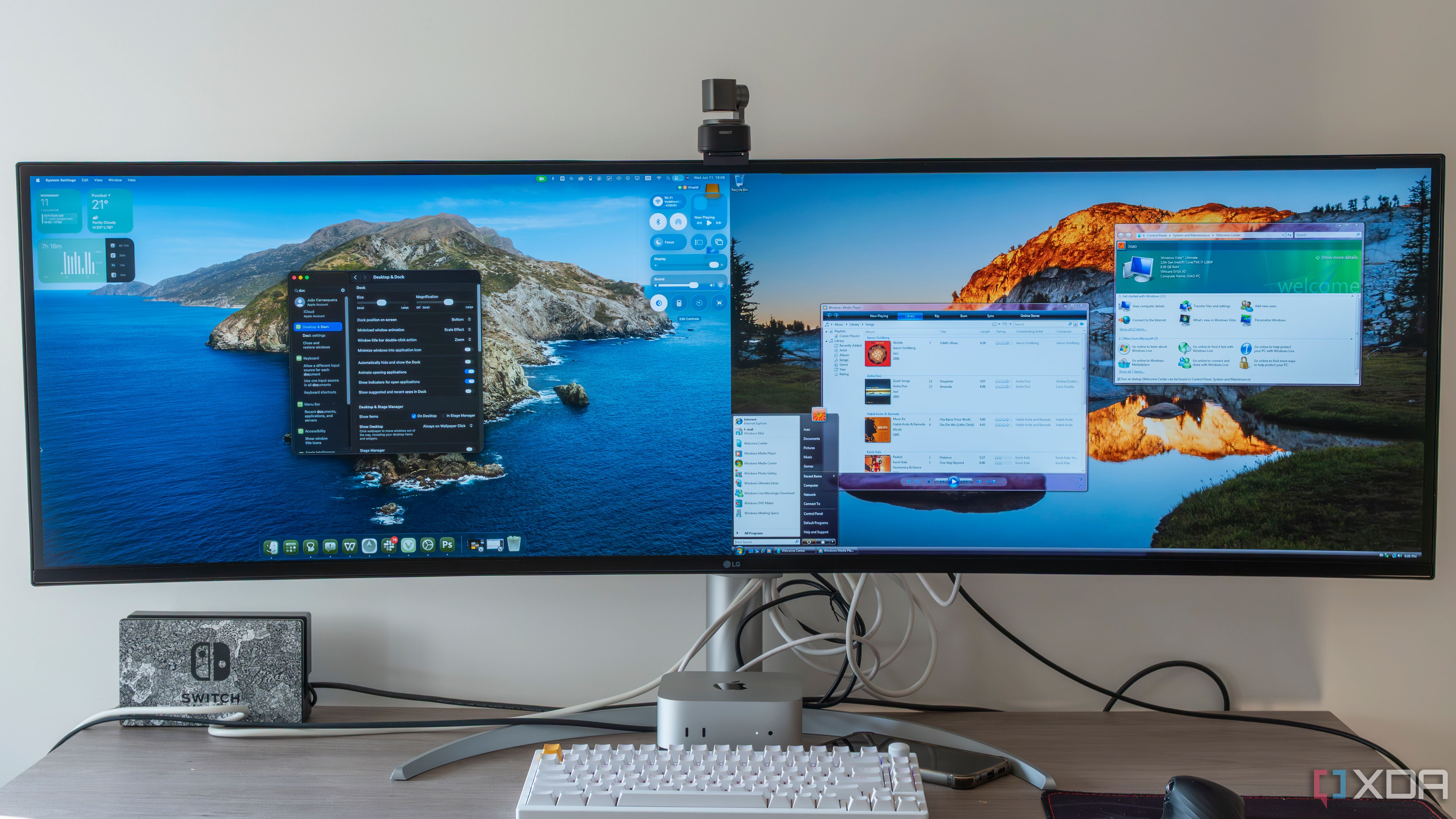
During Apple’s WWDC keynote, when it introduced the new Liquid Glass design material for macOS Tahoe and all other Apple operating systems, it caught my attention right away. This isn’t just because it promises to be shiny and clean, but because it finally feels like the kind of translucent UI Microsoft dreamed about with Aero in Windows Vista. In this case, however, it’s fully realized. Vista introduced a lot of visual polish for its time with Aero, but the implementation was hindered by poor performance and incomplete execution. Liquid Glass, on the other hand, feels like it could finally be a vision that’s actually complete.
It's important to note that my assessment is based on the WWDC keynote and my experiences thus far with the first macOS 26 Tahoe developer beta
This isn’t just about looks, either. Liquid Glass is also a part of a broader shift in how Apple wants to define the visual experience across all its devices. Whether you’re on a Mac, iPhone, iPad, or any other Apple device, Liquid Glass blends transparency with a sense of depth and layering that feels both familiar and new. Unlike Windows Vista, though, Liquid Glass feels less like a novelty and more like a natural part of the operating system’s evolution.
Related
What Liquid Glass actually does
The return of translucency, but this time with more intention
Liquid Glass brings back the sense of layered translucency that Apple introduced in macOS Yosemite in 2014, but it takes the concept even further. Backgrounds blur in a way that feels deliberate, revealing just enough context to anchor where you are in the system. Windows seem to float with more presence, and the effect changes subtly depending on your wallpaper or the content of the window beneath.
This isn’t just eye candy, either. Translucency is used in places where it actually helps, such as making stacked windows easier to differentiate or giving certain sidebars a subtle presence instead of overwhelming the interface. Apple’s approach here seems purposeful, in a way that Vista never quite nailed. Under Windows Vista, Aero often just looked cool without doing much to enhance usability.
The most surprising thing is that even in the first developer beta, it all works quite smoothly. I’ve tested it on my three-year-old M1 Mac Studio, and there’s no perceptible lag or awkward redraws. That’s a sharp contrast to the stuttering and resource-hungry experience many had with Vista’s visuals back in the day.
Why Vista never lived up to the hype
Great idea, poor execution, wrong time
Windows Vista’s Aero was ahead of its time, but not in a good way. The hardware of the mid-2000s just wasn’t ready to support a visual design like that without significant tradeoffs. On launch, even decent machines struggled with UI lag, and power users quickly found themselves disabling it to regain performance. What was supposed to feel futuristic often ended up frustrating.
The problem wasn’t just the hardware, though. Vista’s UI often felt inconsistent, with transparency applied unevenly across apps and system windows. There wasn't a sense of cohesion; it was more like a tech demo that had been rushed out the door before it was fully baked. Even Microsoft seemed to walk it back a bit with Windows 7, tightening things up but stepping away from the full-glass aesthetic.
By comparison, Liquid Glass doesn’t feel like it’s testing my patience. While the first beta does have its quirks and problems, Liquid Glass is already lightweight, balanced, and used where it makes sense. It doesn’t dominate the UI, it supports it. Sure, there are some needed tweaks to the translucency, but the design is already leaps and bounds ahead of where Aero ended.
Why Apple’s timing works now
Hardware, software, and design are in sync
There’s a reason Liquid Glass is poised to work now when Vista’s approach didn’t. Modern Macs are built on a unified hardware-software design philosophy. Apple controls the silicon, the operating system, and the design language. That means it can fine-tune everything to work together without compromise.
M-series chips provide plenty of headroom for visual effects like this. But more importantly, Apple has refined macOS over years of transitions to get to a point where it can support depth and translucency without things getting messy. That’s not something Microsoft had in Vista’s era, nor does it have today. Microsoft has always had to cater to a wide range of third-party hardware, and the result has always been somewhat unpredictable.
Liquid Glass doesn’t feel like it’s trying to prove anything. It’s not a feature, but rather a style that quietly enhances my experience across all my devices. More importantly, it does this without demanding my attention. My iPhone, Apple Watch, my Mac, and even my Apple TV all provide this enhanced experience effortlessly. That’s what Vista wanted to be, but never quite got there.
A visual update that actually works
I’ll be the first to admit that Apple has had hits and misses with its UI designs. Skeuomorphism gave way to flat design, which ultimately became too flat in certain areas. The System Settings app still drives me crazy, and I wish Apple would return to the pre-Ventura System Preferences layout. But Liquid Glass has already found a better middle ground between skeuomorphism and flat design. It’s subtle, expressive, and rooted in performance.
If Microsoft were trying to reimagine Aero’s glass-like aesthetic today, I strongly suspect it would look a lot like what Apple’s doing with macOS Tahoe
What makes Liquid Glass truly feel like the Vista dream realized isn’t just that it looks good; it’s that Liquid Glass is finally showing us what translucent UI design can do when it’s not constrained by bad hardware or half-baked ideas. It’s glass done right. Microsoft may have jumped on the bandwagon in poking fun at the similarities between Liquid Glass and Aero, but let me tell you this: if Microsoft were trying to reimagine Aero’s glass-like aesthetic today, I strongly suspect it would look a lot like what Apple’s doing with macOS Tahoe (and all of its other operating systems.)
Final thoughts on Apple’s Liquid Glass
This new design element and aesthetic feel like a culmination of efforts Apple has been building toward for years. It makes my devices feel more modern without sacrificing clarity (too badly) or performance. It’s not yet perfect, but I have faith that it will result in a gorgeous, polished interface by the time macOS Tahoe is rolled out to the public. In many ways, it closes the loop on a design idea that started nearly two decades ago and shows how far we’ve come since then.


 English (US) ·