.png)
Summary
- Microsoft is updating the Blue Screen of Death (BSOD) to a Black Screen of Death.
- The change is part of the Windows Resiliency Initiative after a large incident with CrowdStrike.
- The new BSOD screen will feature improvements in error collection and readability on Windows 11.
Did you know that the Blue Screen of Death has been around since Windows 3.1, back in 1993? Even before then, Windows 1 and 2 would show a 'blue screen' when it crashed, but there would be no valuable data on it, and the text would just be a jumbled mess. It wasn't until 3.1 that we had the "proper" BSOD screen, which tells you what went wrong and points to a culprit. If we're using this definition for a BSOD, then it has been plaguing computers for 32 years now.
Well, it appears Microsoft has had enough. The company is changing how the BSOD looks, and, well, it's no longer blue. It's still very much a "screen of death," but this time, it's on a black background. I guess now we can call them "Black Screens of Death" or "BSODs" for short. Oh, wait.
The "Black Screen of Death" just kind of looks like a Windows Update screen
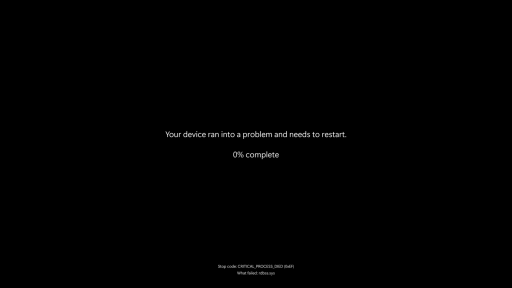
In a post on the Windows Experience Blog, Microsoft shows us what the new BSOD screen looks like. You can check it out above, and...yeah, it's not very flashy, is it? In fact, the text positioning and font make it more look like you're downloading a Windows Update than you are pulling your hair out, trying to figure out what driver is crashing your PC.
However, there's a good chance that Microsoft is deliberately making it less flashy and more professional. The article is about the Windows Resiliency Initiative, which was created after the huge CrowdStrike incident. And what was the most drastic sight we saw during that entire time? That's right; we saw blue screens of death everywhere, striking and painfully evident to anyone walking by them. I don't think they'd have impacted as much if it were just a black screen with minimal white text versus the blue and white screen with the ":(" face on it.
Still, it's not just a color change. It seems Microsoft is making the entire error collection process a lot better, too. As it states on the blog:
The Windows 11 24H2 release included improvements to crash dump collection which reduced downtime during an unexpected restart to about two seconds for most users. We’re introducing a simplified user interface (UI) that pairs with the shortened experience. The updated UI improves readability and aligns better with Windows 11 design principles, while preserving the technical information on the screen for when it is needed.
You may expect this change to only roll out to a business version of Windows 11, but the blog post states that the new BSOD screen will roll out "later this summer on all Windows 11, version 24H2 devices." Sounds like everyone's getting the new screen, then.


 English (US) ·